Thursday, 17 October 2013

Michael Landy – Saints Alive


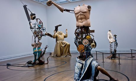
An extremely loud exhibition to say the least, Michael Landy’s saint inspired work is something different, and in some aspects, refreshing. The main aspect of the exhibition is undoubtedly the large scale, mechanical sculptures of saints, and this generally what draws the crowd and gets the most attention, despite a frequent amount of ‘Out of Order’ signs being stuck up everywhere.

Underneath all noise and clamour of the sculptures however is the thought process behind them all, and the collage like sketches of his designs. Thin, complex fine liner drawings are framed and displayed, showing the initial brain wave for the designs, with notes written under certain figures, and aspects drawn from different angles and in different places, and these are actually the most interesting thing in the room if really looked at and considered properly. The larger and glossier final products are obviously equally as impressive, but don’t seem to have that personal edge that the smaller drawings have.

Having a contrast between the duller, more neutral toned saints that have been copied and printed again for this work, against the colourful, crayoned wheels and cogs that Landy brings to the pieces is so inviting – it feels like he is taking something that a lot of people can neglect and look over and bringing it to our attention. It is undeniable that to an untrained eye, the National Gallery can hold some very similar looking paintings, but Landy brings them to us in a refreshing new light, highlighting interesting information that are related to the saints, like how Saint Apollonia was tortured by having her teeth pulled out, or Saint Lawerence was roasted on a griddle.

Unfortunately some of Landy’s works are hard to appreciate due to the sheer height of the walls and the way the pictures have been presented. Having picture above picture above picture saved room on space but allowed us to lose sight of them, along with how brightly lit the room is reflecting garishly off the glass, making it even harder. Putting a detailed fine liner drawing at the top of the room was obviously not the best curatorial decision I’d seen before.

Despite the unflattering curation of the exhibition, it is insightful and extremely relevant to the National Gallery itself, whilst also being educational to those who don’t know a lot of saints (understandably). Landy has created something entertaining out of something unappreciated, and hopefully allowed other people to appreciate it more now.
Running until the 24 November 2013


Facing the Modern - The Portrait in Vienna 1900


The National Gallery is currently holding an exhibition focusing on the modernisation of art trhough the portrait during the 20th century in the turbulent city of Vienna, consisting of art from artists such as Kilmt, Schiele and Kokoschka among many others. It is an insightful view into these leading artists lives, and into the progression of artists mediums and movements in Vienna during the late 19th century.
Curated by Gemma Blackshaw, the exhibition is split into rooms that are centred on themes, such as children, self-portraiture, middle class and the more morbid (but always present) theme of death. Whilst this way of curating gives the viewer the chance to appreciate a collection of similar artworks, it’s not necessarily the best way to present an exhibition that’s main focus is modernisation. Each room has a mix of art ranging from the mid-19th century to the early 20th, and the range of styles during this time makes the title of the exhibition feel insignificant.
Room one gives off a very stately home vibe, with the magnolia coloured walls seeming very old fashioned along with the plain and orthodox individually lit portraiture, setting the initial scene for modernisation to grow from. The contrast between this room and the adjoining room two is striking, as room two is plain, brighter and much more modern, and the first image seen is a brightly, thickly painted Oskar Kokoschka painting, Hans Tietze and Erica Tietze-Conrat’, setting us up for a refreshing modernist change, which unfortunately seems to stagnate and stay similar throughout the rest of the rooms.
The individual style of each artist also isn’t taken into consideration when curating this exhibition; I found that some works that were both made within the same time period offered me completely different appearances, one seeming to fit in with the classical side of Viennese art and others that looked almost figurative, like Schiele’s passionate, impasto based works. The whole of Vienna wasn’t modernised, but certain artists techniques were, and to say that Vienna itself was modernising is wrong too – the wall readings (which were actually very good and informative and gave a lot of context to the paintings) showed how criticised Kokoschka’s work was at the time, somewhat ironically as his work seemed to be the most commissioned of any of the artists shown, and the main artist that showed a development in techniques. 
Most of the artists shown seemed to have a defining style from the start than actually ‘modernise’ themselves, the only notable changing artist seemed to be Klimt, who starts as a conventional and classical portrait artists but ventures into more colourful and experimental ground. His half-finished portrait of Ria Munk is the first thing you see when you enter the 'death' themed room, and it’s colorful yet sad beauty is the highlight of the exhibition.
The room where the aforementioned painting hangs is the most moving part of the exhibition, showing the death masks of both Klimt and Schiele in the center of the darkly painted and dimly lit room. The wall readings are the most powerful here, giving you intense information about the high suicide rate of Jewish people, the Spanish flu epidemic which took both Schiele and his wife, and the political uncertainty of the city.
Although the exhibition seems to have a wavering focus on modernisation, it always seems to be this way with large scale exhibitions that aren’t focused on one, or a few, artists individually. Sometimes artists get lost, themes become difficult to compose and movements and artists don’t get the individual appreciation they deserve. Klimt, Schiele and Kokoschka are undeniably the stars of the show, if only for following the theme of the title the best.
 
Running from the 9 October – 12 January 2014 at the National Gallery, London
More Information


Tuesday, 15 October 2013

Banksy in NYC

I am currently LOVING Banksy's residency in New York. The fact that he's using the whole city to show his work is great, as there are so many aspects of New York that can be played with. The best thing about it all is I don't even have to be there to enjoy it, as his website is updated daily.

Banksy is probably one of the most engaging artists of the time - he enjoys to see the reactions by people to his work, he even has put phone numbers on some of his works for people to ring and learn more, however these 'audio tours' are normally sarcastic and almost pointing fun at people who read into artwork too much. Banksy's work is so refreshingly comedic when addressing the big issues, take animal cruelty and slaughter - instead of making an extremely moving piece of work, he puts stuffed animals in a van and sends them around New York, making their little squeaky noises (which I did particularly find a bit distressing). This resonates with people for longer as its amusing and engaging, yet still addressing the issue.


Monday, 14 October 2013

Seven Days in the Art World - Sarah Thornton

As much as I love going to art galleries and museums, sometimes I don't have the time and I feel like I'm failing as an art blogger because I'm absent most the time, so I've decided to do an art BOOK review! Exciting!

I read this book a couple of months ago and I really enjoyed it, it gives so many insights into the art world and opened my eyes to different roles. As I want to work in the art world, but have no idea which section I want to be in, it really helped.

Sections included art fairs, biennials, artists, magazines, auctions, student art crits, among others - Thornton uses real names all the way through so I became introduced to big names in various sectors of the industry, and how each part works and all the effort and stress that goes into the industry.

This book actually really inspired me to make sure I keep trying to get into the art industry because there are so many roles that need to be played - even the thought of working in an auction house seems really appealing after reading the first chapter of the book. The sheer amount of information that Thornton gives is outstanding, it's definitely a book that can be read by a newbie to art or an experienced member of the art world. I would recommend it to anyone that is studying art, history of art, or looking to get into the art world!

Thursday, 10 October 2013

Sarah Lucas SITUATION @ Whitechapel

To read this on the PI MEDIA website click here

Whitechapel are currently holding Lucas’ first solo exhibition, which may come as a surprise to those who know their modern art – Sarah Lucas was a championing figure in the YBA’s, with Damien Hirst calling her the ‘best’ of them all. So where has she been? From the look of the exhibition, SITUATION, she’s been busy making some pretty explicit looking fruit and veg.

Anyone that knows Lucas’ art is aware of the explicit, too the point, nature of her work, whether this be a ham wearing some knickers and leaking its juices into a stained old mattress, or even the famous table with 2 lemons and a kebab on. Lucas’ ability to turn food and general inanimate objects into something sexual is something of a talent, and it does have to be said that the first room of the exhibition is extremely erotically charged. The whole back wall is wallpapered the tips of penises, very uncomfortable for those who aren’t sexually comfortable about giant penises staring out at them.

Regardless of the content we all knew would be in abundance, the exhibition itself is just quite awkward. It’s a tangled mess of objects that don’t really interlink very well, I found myself having to do 2 laps of the room to take in the majority of the art works whilst snaking in and out of tables, mattresses, chairs, toilet bowls and plinths, which made the whole exhibition a bit too much to take in at first. The messy-ness of the room stressed me out a bit, however the upstairs layout is much easier and calmer.

Absolute Beach Man Rubble is the name of her second exhibition room upstairs and the first thing I notice about the exhibition was the neutral, tamer colouring. Whilst SITUATION gave off a general fleshy pink vibe, the second room was more like beach, with space to move around and enjoy the golden, distorted Henry Moore-esque sculptures. Her style seemed to have developed into less of an explosive, random expression of sexuality to a move civilised, tamer reflection on society – big framed pictures of herself made from cigarette butts are hung from the walls, and her new sculptures reflect the light in a way that make it hard to look away. But when you do look away you’ll see a giant penis crushing a car. So maybe she hasn’t changed that much.


The thing with Sarah Lucas is she takes things that we see every day and turns them into something new, something erotically charged, and we’re not sure how to take it. Who would have known placing a couple of melons and oranges, a cucumber and a bucket would resonate sexually with me. Maybe she’s letting us know how dirty minded we all are.  

Au Naturel, 1994, Copyright the Sarah Lucas, courtesy Sadie Coles HQ

Monday, 7 October 2013

UNITITLED : A Short Exploration of Namelessness


Where would we be without names? How would we refer to places or people or objects? Life would be a lot harder and disconnected if we didn’t have names, however this is a reoccurring trend within the art world. Modern and contemporary art is littered with ‘Untitled’s, some artists even have Untitled 2, 4, 46 in their collections. This disconnection to their paintings is an unsettling show of the mass productivity of art, leading us to question whether or not art still carries the same passion and meaning as before.

When my parents named me, they put a lot of thought into it. Baby books where poured over, relative names were debated, and when they finally chose my name is seemed right. My mum had just spent 9 months making me and it seemed right that she gave me a name she loved. If this was not the case however, and my parents didn’t give me a name, they’d surely at least refer to me through some sort of characteristic – girl? Baby? Noisy? When you think of artists, you have a stereotypical image of someone who is undeniably passionate about their art work, puts their life and soul into everything they create, yet how can they call their work…nothing. Untitled. Every time I see an ‘Untitled’ in a gallery my heart sinks. Poor painting.

For artists now there are a few problems that bring around the need for a nameless artwork. The first of these problems is the mass production of artworks by famous artists, so much so that the paintings are repetitive and almost identical to one another. Think Mark Rothko, unquestionably a very talented artist who had his own distinct style, and since his fame everyone wanted a Rothko hanging in their house. But there are only so many Rothko’s in circulation, and when people are paying an average of $41,000 for a piece of the action, Untitled seems to be the fall back for art that has an infinite amount of brothers and sisters and is being produced to demand. The art market has reached an ever increasing peak, with fine art sales reaching $7 billion in 2012, so its unsurprising that artists would like to create as much art pieces as they can. Whilst his art is worth lots of money, we can’t purely pin point the reason for his untitled works on this. Rothko’s extensive use of vibrant colours were symbolic of religious and political experiences and through the colour he wanted the viewers themselves to feel emotions and take away their own experiences without being told what to feel. Rothko used his own opinions and emotions as his inspiration for colour, but left us to feel something of our own.


Another problem facing new art’s possibility of a name is, widely speaking, the sheer randomness of what we today can count as art. You only have to stumble into the minimalist section of the Tate Modern to come face to face with a room full of ambiguously unnamed art works. Robert Morris, Larry Bell and Donald Judd (among many others) give their work the ever so uncreative name of ‘Untitled’ – where has modern creativity gone? These artists are creating piece of art that sit in world class galleries like the Tate and the MoMa but they are so unidentifiable by name, making the viewer question if these objects had any inspiration behind them, or what the ‘meaning’ of art actually is. There are so many people in this world who look at art and say ‘that’s not art’, and for people like this a name would help them identify with a piece of art and be able to take away an intended message. Minimalism however has always had a trend of naming (or not naming) works Untitled. The lack of defining word given to the art work is to open up the experience of viewing this work to the public and let them understand how they feel best. By giving a piece of art a name in reference to a political, religious or social group or movement, the artists closes the piece of art off to other members of society.


Whilst a name of a painting offers a kind of completion to a piece of work and is indisputably a powerful tool of influence on the viewer, nameless work opens itself up to the audience and makes art broader and accessible to people of all races, religions and languages.